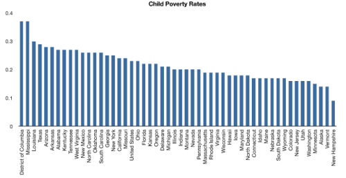
Does it really make sense to compare the District of Columbia, an urban geography with population of less than 600,000 and 68 square miles, to the state of Texas, with population of 24m and 270,000 square miles? These are our political entities though (except for DC) so there is some reason to working with them. Here are child poverty rates (through 18 years of age) by state.
Here is a comparison of child poverty rate by the median age in each state, ranked in ascending order by state median age.

A county level analysis would probably yield better comparisons, although it’d be much more tedious, and the data is probably not as robust or accessible. Some other dimensions for comparing this data:
- Obesity rates
- Literacy rates
- Population density
- Population distribution (across age groups)
- Religiosity
- Education
- State GDP per capita (high GDP per capita is compatible with high poverty rates)
- State GDP from agriculture
- Immigrant population
Hope to get some additional visualizations up in the next week, given that I can find some of these other data.
Note: apparently Blogger’s resizing/linking of uploaded images sucks.